Varsity Amsterdam: A Display Font for Modern Web Design
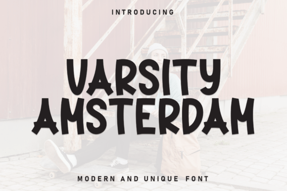
Every web designer knows that typography can make or break a digital experience. The right typeface sets the tone, guides the eye, and reinforces brand trust without the user ever noticing the mechanics at work. Varsity Amsterdam is a display font that brings a specific quality to the table: a casual, neat, and approachable personality that feels both clean and friendly. It is not a neutral sans serif or a rigid geometric typeface. Instead, it offers a balanced middle ground—clean lines, balanced letterforms, and subtle rounded edges that soften the overall impression without sacrificing professionalism.
For designers working on websites, landing pages, and digital products, choosing a display font often means deciding between personality and readability. Varsity Amsterdam avoids that trade-off. Its legible structure makes it suitable for hero titles and section headings, while its warm character adds a human touch to brand-focused interfaces. Whether you are building a boutique online store, a coaching website, or a portfolio landing page, this font can help establish a consistent visual identity that feels intentional rather than generic.
What Makes Varsity Amsterdam Stand Out in Digital Layouts
Display fonts are typically reserved for large sizes, and Varsity Amsterdam performs well in that context. Its letterforms are designed with clarity in mind, which means even at larger display sizes, each character remains distinct and readable. The subtle rounded edges prevent the font from feeling too rigid or corporate, yet it retains enough structure to work across professional applications. This balance is rare in casual display fonts, which often lean too far into decorative territory and lose readability.
The typeface exudes a friendly, approachable vibe without becoming childish or overly playful. This makes it versatile for a range of digital contexts—from creative agency websites to product landing pages for lifestyle brands. When used in a hero section, it immediately communicates approachability, which can help reduce bounce rates and encourage users to explore further. For UI designers, this is a subtle but powerful tool for shaping first impressions.
Where Varsity Amsterdam Shines in Web Interfaces
Varsity Amsterdam is not a body text font. It is a display typeface, which means it works best in larger sizes where its personality can fully express itself. Consider using it for:
- Hero section headlines that need to capture attention quickly
- Section headings that establish a clear visual hierarchy
- Call-to-action buttons and short phrases that benefit from a friendly, confident tone
- Logo text or brand taglines that require a distinctive look
- Decorative accents such as pull quotes, testimonial highlights, or promotional banners
- Online store banners and promotional graphics that need to stand out in a crowded feed
- Blog post headers and category labels that add personality to content sections
In each of these roles, the font helps define the visual rhythm of the page. Because it is a display font, it should be used sparingly to maintain impact. Pairing it with a clean, neutral sans serif for body copy creates a clear contrast that guides the reader naturally from headline to content.
Readability and Visual Hierarchy on Digital Screens
Readability is not just about letterforms—it is about how the font performs across devices, screen sizes, and backgrounds. Varsity Amsterdam holds up well on both light and dark backgrounds, thanks to its balanced stroke contrast and open counters. On dark backgrounds, the subtle rounded edges prevent the letters from feeling harsh, while on light backgrounds, the clean lines maintain crispness. This makes it a reliable choice for image overlays, where text needs to remain legible against varying tones and textures.
For mobile screens, display fonts must retain their character at smaller sizes. Varsity Amsterdam works well for headings on mobile devices, provided you keep the text size large enough to preserve its distinct shape. Avoid using it for small buttons or body copy, as the decorative details may become indistinct. Instead, reserve it for the primary visual moments that define the user's scanning path. A well-placed Varsity Amsterdam headline on a mobile landing page can anchor the layout and guide the user toward the next action.
Building Visual Hierarchy with Varsity Amsterdam
Visual hierarchy is the backbone of effective web design. Varsity Amsterdam can serve as the top tier in that hierarchy, drawing the eye first and establishing the page's mood. From there, a simple sans serif font like Open Sans, Inter, or Lato can take over for subheadings, body text, and navigation elements. This pairing creates a clear distinction between the brand voice and the functional content, making the page easier to scan and more engaging to read.
For example, on a product landing page, the main headline in Varsity Amsterdam immediately communicates the product's friendly or approachable nature. Below it, a clean sans serif explains the features and benefits. The contrast between the two typefaces reinforces the message without requiring additional visual elements. This is the kind of deliberate typographic system that builds trust and keeps users engaged.
Practical Examples in Real Digital Projects
Imagine designing a creative portfolio website for a freelance illustrator or photographer. The homepage hero features a bold introduction line set in Varsity Amsterdam, followed by a brief description in a neutral sans serif. The font's casual neatness matches the creative energy of the portfolio without overwhelming the visual work. It adds personality without competing with the imagery.
For a boutique online store selling handmade goods or curated lifestyle products, Varsity Amsterdam can be used in product category headers, promotional banners, and the main site tagline. Its friendly tone aligns well with brands that emphasize craftsmanship, warmth, and personal connection. When paired with a simple serif font for product descriptions, it creates an editorial feel that elevates the shopping experience.
On a coaching website or course sales page, the font can appear in the main headline and in testimonial highlights. It signals that the brand is approachable and trustworthy, which is essential for service-based businesses. The key is to use it consistently across the key brand touchpoints so that the identity feels cohesive and intentional.
Font Pairing Suggestions for Digital Brand Identity
Pairing Varsity Amsterdam with the right complementary typeface is essential for maintaining a professional digital identity. Because it is a display font with a casual, rounded character, it pairs best with simple, clean typefaces that do not compete for attention. Here are a few pairing strategies that work well in web design:
- With a clean sans serif: A neutral sans serif like Inter, Montserrat, or Work Sans balances the friendly display font with a modern, functional body copy. This is the most versatile pairing for landing pages, online stores, and SaaS interfaces.
- With a classic serif: For a more editorial or sophisticated identity, pair Varsity Amsterdam with a serif font like Merriweather, Playfair Display, or Lora. The serif adds a layer of trust and tradition, while the display font keeps the overall look fresh and approachable. This works well for blogs, course pages, and lifestyle brands.
- With a minimalist script font: If the brand identity leans toward a handcrafted or artistic feel, a subtle script font for accents can complement the rounded edges of Varsity Amsterdam. However, this pairing requires careful spacing and should be used sparingly to avoid visual clutter.
The goal is always to let Varsity Amsterdam lead the visual hierarchy while the supporting typeface handles the heavy lifting of body text and navigation. This approach creates a consistent, professional look across all pages and devices.
Practical Considerations for Web Designers
When using Varsity Amsterdam in web projects, file format compatibility is important. The font is typically available in OTF, TTF, WOFF, and WOFF2 formats. For web use, WOFF2 is preferred due to its smaller file size and faster load times. Ensure that your web font kit includes all necessary formats to support cross-browser rendering. If you are using a font delivery service or self-hosting, confirm that the licensing allows for web embedding.
Regarding weights and styles, check what is included with your purchase. Some display fonts come with multiple weights, while others are limited to a single style. If Varsity Amsterdam offers only one weight, you can still create hierarchy through size, color, and spacing rather than relying on weight variations. This is actually a good practice for maintaining visual consistency.
Multilingual support is another factor to consider. If your project targets an international audience, verify that the font includes the necessary character sets. Many premium display fonts cover a broad range of Latin-based languages, but it is always wise to check before committing to a design.
Commercial Licensing for Client Projects and Online Stores
One of the most important steps when using a premium font like Varsity Amsterdam is understanding the commercial licensing terms. If you are designing for a client website, an online store, a landing page, or a digital brand kit, you need a license that covers commercial use. This typically includes web embedding rights, which allow the font to be loaded on a website and displayed to visitors.
For designers working on multiple client projects, look for a license that covers a certain number of domains or users. Some font licenses are per project, while others offer broader usage. Always read the terms carefully to avoid legal issues. Proper licensing also supports the type designer and ensures that the font remains available and updated for future use.
For digital products like templates, themes, or brand assets, the licensing terms may differ. You may need an extended license to include the font in a downloadable product. Check the specific restrictions before distributing any design assets that contain the font.
Why Varsity Amsterdam Belongs in Your Digital Toolkit
Web design is about more than just aesthetics—it is about creating experiences that feel coherent, trustworthy, and easy to use. Typography is a core part of that equation. Varsity Amsterdam offers a unique combination of casual friendliness and neat structure that makes it a strong candidate for display roles in modern digital projects. It works well for hero sections, headings, banners, and brand accents, especially when paired with a clean supporting typeface.
Its performance on mobile screens, its readability on various backgrounds, and its ability to communicate approachability without sacrificing professionalism make it a versatile choice for web designers, UI designers, and digital product creators. Whether you are building a boutique online store, a coaching website, a creative portfolio, or a course sales page, Varsity Amsterdam can help you establish a consistent, engaging brand identity that resonates with users.
Add it to your font library, test it in your next landing page design, and see how a well-chosen display font can elevate the entire user experience. The right typeface does not just decorate the page—it shapes the way people feel about your brand.